1. This appeal arises in an action for infringement of two Registered Community Designs (“RCDs”) depicting aspects of the design of heart rate monitoring devices which can be worn on the wrists of those with an interest in their cardiac performance. The RCDs are in the name of the appellant, PulseOn Oy (“PulseOn”). PulseOn alleges that the respondent, Garmin (Europe) Limited (“Garmin”) has infringed the RCDs by importing and selling a number of models of smart watch in which the registered designs, or designs which do not produce a different overall impression, are incorporated. The judge, Mr Roger Wyand QC sitting as a Deputy High Court Judge, found both RCDs to be valid, but neither of them to be infringed. PulseOn appeals with permission which I granted on 1 May 2018.
2. On the appeal, Mr James Mellor QC and Mr Maxwell Keay appeared for PulseOn. Mr Hugo Cuddigan QC and Mr Ben Longstaff appeared for Garmin.
Wrist Heart Rate Monitors (“WHRMs”)
3. WHRMs operate by using light to measure changes in tissue volume caused by pulsing blood flow. One or more light sources (in practice LEDs) are placed against the skin of the wrist in sufficient proximity to a photo detector or sensor which is also so placed. The amount of light which reaches the detector is affected by the small changes in tissue volume caused by the pulsating blood flow. The consequent variations in the light signal can be processed to deduce a heart rate.
4. A fact which is relevant to the design of a WHRM is that different colour LEDs need to be placed closer or further away from the photo sensor, because of the difference in the wavelength of the emitted light.
The RCDs in issue
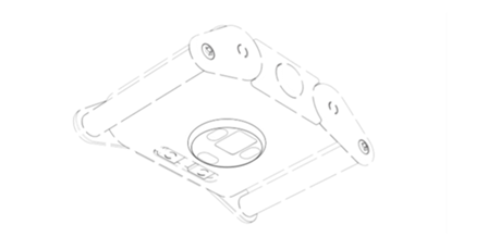
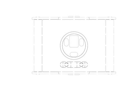
5. The two RCDS in issue are Nos 002473769-0004 and 002473769-0005 referred to as “RCD 4” and “RCD 5” respectively. Both the RCDs specify that the products to which they are to be applied are “physical activity meters”. Each RCD has one plan and one isometric representation showing the rear or backplate of a WHRM, absent the strap to attach it to the user’s wrist. The representations in RCD 4 are reproduced below:

6. The RCDs adopt the convention, recognised by the Guidelines for Examination of Registered Community Designs published by the EU Intellectual Property Office (“the Guidelines”), that features for which protection is not claimed are shown in dotted lines. The Guidelines refer to this notation as the use of a “visual disclaimer”. There is a dispute about whether protection is claimed for the small Torx screws which secure the bar to which the wristband is attached, or whether the screws are intended to be excluded by visual disclaimer. The judge held that they were excluded, essentially as an obvious mistake, but Garmin challenge that conclusion in their respondent’s notice. For present purposes I will assume, without deciding, that the judge was correct on that point, and that the Torx screws are not part of the designs.
7. RCD 5 is identical to RCD 4 except that the circular raised portion in the middle of the backplate is shown in dotted lines and thus does not form part of the design.
8. It will be seen that the RCDs have three identically shaped, round ended oblong features, disposed around a larger rectangular feature. In the case of RCD 4 these features are surrounded by two concentric circles. It is common ground that the informed user would interpret the three oblong features as LED apertures. Two of these LED apertures are placed along two opposite sides of the central, rectangular aperture, which would be interpreted as a photo sensor aperture. The third LED aperture is spaced further apart, perpendicular to the first two, but parallel to a third side of the photo sensor aperture. I call this the third LED aperture. The two concentric circles would be interpreted as a circular raised platform of shallow frusto-conical shape, which has the function of maintaining the LEDs and the photo sensor in close contact with the wearer’s skin.
9. It might be thought odd that so much effort should go in to the protection of the design of the back of a WHRM, which is a part which is not visible in normal use. However, the back is normally visible when the WHRM is sold, and when it is taken on and off. The relevant legislation (to which I will come) only requires the features of the design to be “visible”, and, for at least some of the time, the features of the back are visible. The appearance of the back also features in some of the parties’ marketing materials, albeit when emphasising the technical features of the watch.
The Garmin WHRMs complained of
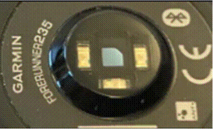
10. PulseOn alleges that a group of models of Garmin WHRM infringe RCD 4 and RCD 5, and a further group infringe RCD 5 alone. It is sufficient to explain the issues if I focus on the Garmin Forerunner 235, which is said to infringe both registered designs. It looks like this enlarged photograph:

11. The features concerned are not the LEDs themselves, but the apertures within which they appear, which can (just) be seen surrounding the LEDs in the photograph. As I shall explain, the judge relied on a model with which he was supplied which showed these apertures much more clearly (see below). In the photograph, the central photo sensor aperture can (again, just) be seen to have an arched top, which was reproduced in the model given to the judge. The judge assumed that all the Garmin models complained of had this feature, whereas it transpired that this was not true of two of the models. Those had a straight top, making the photo sensor aperture a rectangle, with radiused corners.
The Regulation
12. RCDs are governed by Council Regulation (EC) No 6/2002 of 12 December 2001 on Community Designs (“the Regulation”). To qualify for registration, the Regulation requires that the design must satisfy the twin requirements of novelty and “individual character”.
13. I set out below the relevant parts of the Regulation:
Article 3
For the purposes of this Regulation:
(a) ‘design’ means the appearance of the whole or a part of a product resulting from the features of, in particular, the lines, contours, colours, shape, texture and/or materials of the product itself and/or its ornamentation…
Article 5
1. A design shall be considered to be new if no identical design has been made available to the public:
… (b) in the case of a registered Community design, before the date of filing of the application for registration of the design for which protection is claimed, or, if priority is claimed, the date of priority.
2. Designs shall be deemed to be identical if their features differ only in immaterial details.
Article 6
1. A design shall be considered to have individual character if the overall impression it produces on the informed user differs from the overall impression produced on such a user by any design which has been made available to the public:
…
(b) in the case of a registered Community design, before the date of filing the application for registration or, if a priority is claimed, the date of priority.
2. In assessing individual character, the degree of freedom of the designer in developing the design shall be taken into consideration.
Article 8
1. A Community design shall not subsist in features of appearance of a product which are solely dictated by its technical function.
…
Article 10
1. The scope of the protection conferred by a Community design shall include any design which does not produce on the informed user a different overall impression.
2. In assessing the scope of protection, the degree of freedom of the designer in developing his design shall be taken into consideration.
14. A design which has novelty under Article 5, because its features differ from an existing design in details which are not “immaterial”, may nevertheless fail for lack of individual character under Article 6. To have individual character the design must create a different overall impression on the informed user from that produced by any existing, prior published design. The comparison must be with the overall impression of each design relied on from the prior art “considered individually”, and not by “a combination of features taken in isolation and drawn from a number of earlier designs”: see Case C-345/13 Karen Millen Fashions Ltd v Dunnes Stores [2016] ECDR 13 at [23] - [35].
15. The provisions relating to validity dovetail with those relating to the scope of protection and thus infringement. The scope of protection includes all designs which create the same overall impression as the registered design (or, as the Regulation prefers to put it in Article 10, designs which do not produce a different overall impression). Thus, the overall impression created by the registered design is used to determine both infringement and validity. As with other areas of intellectual property law, such as patents, it is important to apply a consistent approach when determining infringement and validity. Whilst the two issues are distinct, the overall impression created by the design deployed in determining each issue must be the same.
16. The scope of protection is determined through the eyes of the informed user. The characteristics of the informed user have been considered in a number of cases, both in the Court of Justice and in our national courts. In Samsung v Apple [2012] EWCA Civ 1339; [2013] FSR 9 this court approved a summary by HHJ Birss QC sitting as a Deputy High Court Judge (as he then was) of the identity and attributes of the informed user:
“[33] The designs are assessed from the perspective of the informed user. The identity and attributes of the informed user have been discussed by the Court of Justice of the European Union in PepsiCo Inc v Grupo Promer Mon-Graphic SA (C-281/10 P) [2012] FSR 5 at paragraphs 53 to 59 and also in Grupo Promer v OHIM (T-9/07) [2010] ECDR 7 , (in the General Court from which PepsiCo was an appeal) and in Shenzhen Taiden v OHIM (T-153/08), judgment of 22 June 2010.
[34] Samsung submitted that the following summary characterises the informed user. I accept it and have added cross-references to the cases mentioned:
He (or she) is a user of the product in which the design is intended to be incorporated, not a designer, technical expert, manufacturer or seller ( PepsiCo paragraph 54 referring to Grupo Promer paragraph 62; Shenzhen paragraph 46).
However, unlike the average consumer of trade mark law, he is particularly observant ( PepsiCo paragraph 53);
He has knowledge of the design corpus and of the design features normally included in the designs existing in the sector concerned ( PepsiCo paragraph 59 and also paragraph 54 referring to Grupo Promer paragraph 62);
He is interested in the products concerned and shows a relatively high degree of attention when he uses them ( PepsiCo paragraph 59);
He conducts a direct comparison of the designs in issue unless there are specific circumstances or the devices have certain characteristics which make it impractical or uncommon to do so ( PepsiCo paragraph 55).
[35] I would add that the informed user neither (a) merely perceives the designs as a whole and does not analyse details, nor (b) observes in detail minimal differences which may exist ( PepsiCo paragraph 59).”
17.  Articles 6(2) (validity) and 10(2) (scope of protection) mandate that the degree of freedom open to the designer is to be taken into consideration. The informed user is not impressed by similarities in features where there is little or no design freedom, for example because the feature is to some extent dictated by function. Jacob LJ put it in this way in Procter & Gamble Co v Reckitt Benckiser (UK) Ltd [2007] EWCA Civ 936; [2008] FSR 8 at [29]:
“Another thing is also clear. Where shapes are, to some extent, required to be the way they are by reason of function, the informed user is taken to know that. That is what Art.6(2) (for validity) and Art.10(2) (for scope of protection) require. Take an aspect of this case. Both products have a trigger and something of a ‘‘pistol grip’’. There is some constraint on design freedom for this—the product must be grippable so that the index finger can pull the trigger, the trigger must be shaped to fit the finger and have sufficient space behind it for it to be pulled. That is a given. The informed user must take those requirements into account when assessing overall impression.”
18. A phrase which is also used in the context of assessing overall impression is “design corpus”, which suggests a body of designs in a given field, rather than an individual design. The phrase comes from Recital 14, which provides that the informed user takes it into account when considering individual character:
“The assessment as to whether a design has individual character should be based on whether the overall impression produced on an informed user viewing the design clearly differs from that produced on him by the existing design corpus, taking into consideration the nature of the product to which the design is applied or in which it is incorporated and in particular the industrial sector to which it belongs and the degree of freedom of the designer in developing the design.’’
 As has been pointed out (for example in paragraph 32 of Karen Millen Fashions, cited above at [14]) , “design corpus” is not a phrase used in any of the provisions of the Regulation and, as I have said, individual character is in fact to be assessed on a design by design basis. Nevertheless, it has been recognised that, in the assessment of overall impression, the informed user “has some awareness of the prior art”: Case T-9/07 Grupo Promer Mon Graphic SA v OHIM [2010] ECDR 7 at [72]. If the registered design is close to the existing design corpus for that type of article, the court will be astute not to afford too broad a degree of protection: see Procter & Gamble at [35(iii)].
19. Whilst the impression is of the design as a whole, it is also legitimate to consider each feature and decide how common it is in the design field in question, provided always that one keeps in mind that it is the design as a whole with which one is concerned. Thus, in Samsung v Apple HHJ Birss QC at first instance ([2012] EWHC 1882) had held at [52] that the degree to which a feature was common in the design corpus was a relevant consideration:
“At one extreme will be a unique feature not in the prior art at all, at the other extreme will be a banal feature found in every example of the type. In between there will be features which are fairly common but are not ubiquitous or quite rare but not unheard of. These considerations go to the weight to be attached to the feature, always bearing in mind that the issue is all about what the items look like and that the appearance of features falling within a given descriptive phrase may vary.”
In this court, an attack was launched on what was said to be the judge’s piecemeal approach to overall impression based on analysis of each feature in isolation, stripped of its context. The Court of Appeal rejected that attack on that approach: see paragraphs 27-28, pointing out, nevertheless, that it is not legitimate to pick out features from the prior art and argue that one set of articles have one feature, another set of articles have a second feature, and a third set have a third feature and, by that process discount all the three features. If that were correct it would be impossible to protect a novel combination of features if they were all individually known from the prior art.
20. This is all consistent with what Kitchin LJ (as he then was) said in Magmatic v PMS International [2014] RPC 24; [2014] EWCA Civ 181, at [45]:
“I would add that the two designs must therefore be considered globally and, as one would expect, the informed user will attach less significance to those features which form part of the design corpus and correspondingly greater significance to those features which do not.”
21. Mr Mellor did not suggest that there was not a sliding scale of weight to be attached to features in the overall assessment, provided of course one kept the whole design in mind. He submitted, I believe correctly, that for a feature to be treated as completely banal would require convincing evidence to that effect.
22. Mr Mellor also submitted that it was only if features were “standardised”, in the sense that every design in the design corpus adopted them, that they could be treated as supporting the existence of limitations on design freedom. He sought to derive some support for this from the judgment of Arnold J in Whitby Specialist Vehicles Limited v Yorkshire Specialist Vehicles Limited [2014] EWHC 4242 (Pat); [2016] FSR 5 at [32] to [35], but I do not understand those paragraphs to support that proposition. Of course, one cannot, without more, infer a limitation on design freedom from the existence of a number of similar designs. That could simply be due to a design trend: Case (T-357/12) Sachi Premium-Outdoor Furniture Lda v OHIM EU:T:2014:55 at [23]. The court must assess all the evidence which touches on the designer’s degree of freedom and feed it into the overall assessment.
23. It scarcely needs to be said that the Regulation’s reference to the degree of design freedom means that it is to be taken into consideration not only where the design of a particular feature is absolutely mandated, but also where it is, to a greater or lesser extent, constrained.
The judgment of Roger Wyand QC
24. The judge found that the informed user in the present case was a purchaser of WHRMs. Such a user would be interested in the aesthetic appearance of the device and would be aware of the design corpus. There is no challenge to his conclusion in that respect. He went on to make the following findings about the design corpus:
i) The rear surfaces have an aperture for a photo sensor and further apertures for one or more LEDs;
ii) The photo sensor aperture is central and is generally of a rectangular shape, sometimes rounded;
iii) It is common for there to be two LED apertures, one either side of the photo sensor aperture, equidistant therefrom, the distance from the photo sensor being small. There may also be further LED apertures;
iv) The apertures are commonly within a raised platform, smaller than the back of the product;
v) The raised platform is commonly round.
25. Although two LED apertures and one photo sensor aperture arranged in a straight line with the photo sensor in the middle are common, other arrangements appeared in the design corpus and the size and shape of the apertures varied, as did the size and shape of the raised platform (see paragraph 23).
26. The judge next dealt with the challenge to the validity of the RCDs on the ground set out in Article 8(1) of the Regulation, namely that all the features of the design were dictated solely by function. The challenge related to:
i) The raised platform;
ii) The layout of the photo sensor and LED apertures in relation to two aspects:
a) The symmetrical disposition of the four apertures about the lateral axis of the device; and
b) The spacing of the apertures of the photo sensor and the central LED; and
iii) The shape of the apertures.
27. The judge rejected each of these challenges essentially on the basis that whilst all possible designs would fulfil a technical purpose, the reasonable observer would think that aesthetic considerations played some part in the design.
28. The judge then turned to the scope of protection and the effect on the scope of protection of the design corpus and the degree of design freedom. The judge made findings that the following were limitations on the degree of design freedom:
i) The number of LEDs (paragraph 47);
ii) All apertures must be of sufficient size, compared to the LEDs and the photo sensor, to allow them to function (paragraph 48);
iii) Where the system is designed to use green LEDs, the LEDs must be as close as possible to the photo sensor. A red LED can be further away. The judge continued in paragraph 49:
“A system designed for the use of two green LEDs and one red LED will have two apertures close to the central photo sensor aperture and one further away. Two LED apertures and the photo sensor aperture will be in a line, although there is no restriction as to whether the line is parallel or transverse (or at an angle to) the line of the strap. There is design freedom as to where the third LED aperture is located.”
iv) The judge then said this at paragraph 50:
“Where three green LEDs are used, all three apertures need to be placed close to the photo sensor aperture. There is little design freedom as to their placement since they will have to be on three of the four sides of the photo sensor aperture in a horseshoe arrangement. Again there is design freedom as to the orientation of the line through three of the the four apertures”.
v) The design freedom in relation to the raised platform was limited by the following: (i) the platform must fit within the footprint of the back of the device; (ii) it must not have sharp edges; (iii) where the device has charging points (which should be outside the raised platform) the size of the platform is correspondingly limited; (iv) the platform must encompass all the apertures. Subject to those factors, there was design freedom as to the outline of the platform and its height above the casing (paragraph 51).
29. The judge found that, although there was individual character in the designs, it was limited, due largely to the limited design freedom, and the scope of protection was similarly limited. The individual character was limited to (i) the size and shape of the apertures; (ii) the positioning of the asymmetrically placed (third) aperture; (iii) the orientation and offset positioning of the line through the two LED apertures and the photo sensor aperture; and, in the case of RCD 4, the shape and size of the raised platform.
30. The judge then considered and rejected a challenge to validity based on a comparison of the two RCDs with two items of prior art: W02013/148753 (“Basu”), and the Scosche Rhythm+ WHRM (“Scosche”). In each case he held that the designs had individual character when compared to the prior art in question.
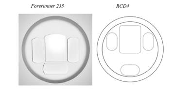
31. Finally the judge came to the comparison of the RCDs with the Garmin devices complained of. In relation to the comparison of RCD 4 with the Forerunner 235 design the judge relied on an enlarged model of the Forerunner 235 set alongside the part of RCD 4 showing the raised platform and apertures, which I set out below:

32. The judge found the following differences between the design of the Forerunner 235 and RCD 4:
i) There were significant differences in the size and shape of the LED apertures;
ii) The photo sensor aperture of the Forerunner 235 design was curved at the top whereas, in RCD 4 it was flat;
iii) The placing of the photo sensor aperture in the Forerunner 235 was almost in the middle of the raised platform, whereas it was very close to the top in RCD 4;
iv) The line through the two LED apertures and the photo sensor runs through the centre of the raised platform, whereas it does not do so in RCD 4;
v) The three LED apertures in the Forerunner 235 are not as close to the edge of the platform as they are in RCD 4.
33. There were the following similarities between RCD 4 and the Forerunner 235 design:
i) The number of apertures;
ii) The fact that there are three apertures in a row with a fourth in the middle below;
iii) The three LED apertures are all the same shape as each other (but not between designs);
iv) The three LED apertures are all smaller than the photo sensor aperture;
v) The raised platforms are both circular and encompass all the apertures.
34. Despite the noted similarities the judge concluded that the Forerunner 235 “ would not produce an identical impression on the informed user to that produced by RCD 4 ”.
35. Turning to RCD 5, the judge also considered a comparison with the Forerunner 235 (amongst other models). The raised platform does not form part of the design protected by RCD 5: that had an impact on some of the similarities and differences and how they were expressed. The differences were:
i) Significant differences in the size and shape of the LED apertures;
ii) The difference in the shape of the top of the photo sensor;
iii) The difference in the positioning of the photo sensor in relation to the backplate: in the accused designs it was almost in the middle whereas in RCD5 it was offset.
36. The relevant similarities were:
i) The number of apertures;
ii) The fact that there are three apertures in a row with a fourth in the middle below;
iii) The three LED apertures are all the same shape as each other (but not between designs);
iv) The three LED apertures are all smaller than the photo sensor aperture.
37. The judge’s conclusion at [69] was again that, despite the similarities, the Forerunner 235 (and other models considered in this group) “ would not produce an identical impression on the informed user to that produced by RCD5 ”.
38. A third group of models including the Fenix Chronos, which had the same aperture arrangement and circular raised platform as the Forerunner 235 did not infringe for the same reasons. For similar reasons, the Approach X40, the Forerunner 30 and Forerunner 35, which have a square raised platform and the same aperture arrangement also did not infringe.
The grounds of appeal
39. PulseOn’s grounds of appeal can be summarised as follows:
i) Ground 1: The judge was wrong to find that where three green LEDs are used in a WHRM there is little design freedom. The judge was wrong to say at [50] that the three LEDs would be placed on three of the four sides of the photo sensor in a horseshoe arrangement. He had failed to take into account the Wellograph Wellness Watch, which had three green LEDs in a different arrangement, and had failed to realise that his horseshoe arrangement was only required because of the size of the apertures chosen by the designer. The judge had also been wrong at [49] to say that, where two green LEDs and a red LED were used, two LEDs and a photo sensor will be in a line. Accordingly, the judge ought to have held that the two RCDs, given the wider design freedom, were entitled to a broad scope of protection.
ii) Ground 2: When considering the comparison between the RCDs and the Garmin products, the judge wrongly compared the RCDs to enlarged 3D models of the Garmin products. This gave rise to two errors: (i) certain models did not have the curve at the top; (ii) the enlarged models made slight differences appear more significant.
iii) Ground 3: The judge attached undue weight to features which were determined by technical considerations. The differences which the judge identified in the positioning of the line through the LEDs and the sensor in relation to the raised platform/backplate were determined by technical considerations.
iv) Ground 4: The judge, by asking himself whether the accused devices would produce an identical impression on the informed user, applied the wrong test for infringement.
40. In opening the appeal, Mr Mellor made it clear that he wished to argue the appeal on a wider basis. We asked him to formulate the expanded grounds in writing. This exercise was attempted by Mr Keay whilst Mr Mellor was on his feet opening the appeal, but the document produced as a result (and handed to Mr Cuddigan in the course of the morning) even then failed to capture all the points which Mr Mellor proposed to run. The complete list of further grounds of appeal is as follows:
i) In comparing the RCDs to the design corpus, the judge wrongly relied on a list of disembodied features rather than the designs themselves, taken individually. This error led him to conclude that the designer’s degree of freedom was more limited than it in fact was.
ii) The judge’s finding at paragraph 22(v) that the raised platform is commonly round was wrong and had no basis in the evidence. Only one device, the Apple watch, had a circular raised platform.
iii) The judge had wrongly limited his consideration of the design corpus to the pleaded devices, and wrongly took into account the Rolex Submariner watch contrary to his finding that the design corpus consisted of WHRM devices.
iv) In assessing the designer’s degree of freedom at paragraph 47 the judge failed to consider the whole of the design process. He wrongly took as a starting point that a 3 LED system had been selected. He should have held that there was a design freedom in making that selection.
41. These arguments embrace alleged errors in the approach adopted by the judge as well as factual errors. Mr Cuddigan objected to the introduction of the new grounds, which had not been foreshadowed by any prior application, correspondence or even notice. He submitted that Garmin’s first notification was when Mr Mellor started to ventilate these arguments orally, and their precise exposition came later still. No acceptable explanation had been given for raising the points in this way given that the case had been fully argued out in skeleton arguments, including two skeleton arguments from the appellant. The respondent had formulated its respondent’s notice in response to the original grounds of appeal, and had not come to meet a case presented on this different basis. Moreover the case was one which had been run in the Chancery Division’s Shorter Trials Scheme, an abbreviated procedure designed to avoid procedural manoeuvering of this kind. It would undermine that procedure if a lax approach were taken to amendments of grounds of appeal.
42. I would not allow the appellant to advance the new grounds of appeal in this way, essentially for the reasons given by Mr Cuddigan. Quite apart from the point made based on the Shorter Trials Scheme, the procedure in this court is designed to focus argument on specific grounds of error by the court of first instance. The procedure includes examination of those grounds at a permission hearing, supported by a skeleton argument which is intended to be focused on those grounds. In this way, a respondent is afforded a reasonable opportunity to consider its response to the appeal, answer it in writing, file any relevant respondent’s notice, and prepare for a time-limited and focused hearing. The prejudice inherent in having new grounds of appeal advanced orally at a hearing is self-evident, depriving the respondent of these built-in protections. The absence of any proper explanation as to why these grounds were not raised earlier is also entitled to considerable weight. Even a few days’ notice of the draft grounds might have enabled the prejudice to Garmin to be limited, and it appears, from the account we were given, that such notice would have been possible.
43. I will take each of the original grounds in turn. It is convenient to start with ground 4.
Ground 4
44. Mr Mellor submitted that the judge had applied the wrong test for infringement. In making the relevant comparisons he had only considered whether the products produced an identical impression. The correct test for infringement is whether the allegedly infringing design produces on the informed user a different overall impression.
45. Mr Cuddigan submitted that the judge had not fallen into error here. He had used the word “identical” because it was an antonym for “different”. The judge had made it clear that it was the overall impression which counted throughout his judgment. The omission of the word “overall” in paragraphs 66 and 69 did not show that he had suddenly, and without explanation, applied an incorrect test.
46. In my judgment, despite the language which he chose in paragraphs 66 and 69, the judge did not apply an incorrect test. By saying that the designs did not create an identical impression, the judge was deciding that the impressions were different.
47. As to the failure to use the word “overall” in paragraphs 66 and 69, the appellants have severed the cited paragraphs of the judgment from their context in the judgment as a whole. Thus, the judge summarised the allegations of infringement at [12] and [13] by saying that the accused products were products in which the design “ or a design which does not produce a different overall impression ” was incorporated. At [15] the judge summarised Garmin’s primary position as being that the RCDs were valid but that “ the products alleged to infringe produce a different overall impression ”. The judge then gave himself a correct direction as to the law at paragraph 17(vi) where he emphasised the need to assess the respective “ overall impressions ” of the RCD and the alleged infringing design. At paragraphs 28 and 29 he cited from HHJ Birss QC’s caution in Samsung v Apple that it was necessary in the end “ to pull it all together and consider the overall impression ” and he stated that he would bear this in mind when he considered “ the overall impression below ”. Indeed, at [52] he said “ I must (and do) bear in mind that it is the overall impression which counts, that is the visual appearance, not a verbalised list of features ”. When considering the RCDs in comparison with Basu at paragraph 62, the judge decided that “the proportions, shapes and relative sizes of the apertures are significantly different and produce a different overall impression ”, and that taking into account the differences in separation of the apertures “ the overall impressions are even more different”. Then, at paragraph 64, when introducing the issue of infringement in relation to the group of devices alleged to infringe RCD 4, the judge identified PulseOn’s allegation as being that the accused devices were “products in which the design, or a design which does not produce a different overall impression ” were incorporated. Having identified “significant” differences, in relation to that group, the judge repeats this formulation at paragraph 67 when dealing with the group of devices alleged to infringe RCD 5. He again identifies “significant differences” at paragraph 68. Finally, when considering a further group at paragraph 73 and following he says at paragraph 77 that “none of these products produce on the informed user the same overall impression ”.
48. It is to my mind inconceivable that this experienced deputy judge would have fallen into the error of applying a different test in relation to two of the comparisons which he had to perform. In the context of his self-direction on the law, his approach to the comparisons required to deal with the attack on validity and his correct formulation of the test at [77], it is quite clear that the judge had in mind throughout the correct test and applied it.
49. Mr Mellor also submitted that the judge had failed to verbalise his overall assessments in the manner which he submitted was mandatory, following what Jacob LJ had said at paragraph 35(vi) of Procter & Gamble :
“The court must identify the “overall impression” of the registered design with care. True it is that it is difficult to put into language, and it is helpful to use pictures as part of the identification, but the exercise must be done”.
50. I do not think there is anything in this criticism. The judge made his assessment of the overall impression clear by the use of the pictures with which he was supplied, and by considering and giving appropriate weight to the similarities and differences when he came to compare the alleged infringement. I do not think he went wrong in principle by adopting this approach (compare the approach of Arnold J in Whitby Specialist Vehicles Ltd v Yorkshire Specialist Vehicles Ltd [2104] EWHC 4242 (Pat); [2016] FSR 5 at [39]).
51. I would therefore reject ground 4.
Ground 1
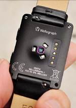
52. Mr Mellor submitted that the judge had made errors in both paragraphs 50 and 49. The Wellograph Wellness Watch (“the Wellograph”) and the Omron HR-500U (“the Omron”), which formed part of the design corpus, showed that a WHRM device with three green LEDs did not have to be placed on three of the four sides of the photo sensor, as the judge had held in paragraph 50. The Wellograph looks like this:

53. The Omron looks like this:

54. The constraint on design freedom which the judge had identified at paragraph 50 did not therefore exist. It was also wrong to say, as the judge had said at paragraph 49, that where there were two green and one red LEDs, two of the LEDs would have to be placed in a line with the photo sensor. This was again shown to be wrong by the Wellograph and the Omron. The judge should have concluded that there was considerable design freedom available to the designer, and the RCDs were accordingly entitled to a greater scope of protection.
55. Mr Cuddigan submitted that where two green LEDs and one red LED were to be deployed with a rectangular photo sensor aperture, the green LEDs needed to be as close as possible to the rectangular photo sensor, and the red could be further away, exactly as the judge had held in paragraph 49. Neither the Wellograph nor the Omron undermined this conclusion as neither was an example of two green and one red LED. As to the two LED apertures and the photo sensor aperture being in a line, this was the optimal arrangement. The judge had been right to say there was little design freedom in this respect, whilst recognising that there was design freedom as to the placement of the third LED aperture. There was no evidence whatever of the technical performance of the Wellograph and the Omron, and it was likely that they were not optimal arrangements, given that the evidence showed that both parties had independently arrived at their arrangements by a process of optimisation. Although the judge might have slightly overstated the position by saying in paragraph 50 that three green LEDs had to be on three of the four sides, that was of no materiality. His overall conclusion that there was little design freedom was still valid.
56. I am not persuaded that the informed user should be taken to be aware that the arrangement shown in the registered design was optimal as compared to other possible arrangements. The informed user is not an expert engineer and is not to be taken to be aware of all the engineering considerations which went into the finalisation of a particular design. Mr Mellor submitted that this approach would undesirably open the door to a large body of evidence in every registered design case, and I agree. Such matters are not properly regarded as limits on design freedom, particularly where there exists evidence of alternative configurations. It follows that the optimisation argument is not a legitimate basis for arriving at the conclusion that three LEDs had to be on three of the four sides of a rectangular sensor. That argument does not appear to have been relied on by the judge in any event.
57. Nevertheless, the fact that the judge may have stated the design freedom a little more narrowly than he should have done in relation to this particular feature, does not in my judgment result in a significantly wider scope of protection for these registered designs. The three LED apertures have to be distributed around the rectangular sensor aperture in order to communicate with it. It is true that the three LEDs do not have to be placed along the three sides of the photo sensor aperture, but that is one amongst a very limited number of fairly unremarkable choices. The Wellograph merely shows that the way in which three LED apertures are distributed around the central sensor aperture is open to some limited design choice. Their distance from the sensor is constrained by functional considerations. The judge’s conclusion that there was limited design freedom in this highly functional environment remains entirely apt.
58. Of course, design freedom is not the only influence on the scope of protection. The placing of the two LED apertures in line with a central rectangular sensor aperture was found by the judge to be common in the design corpus. I would only add that I was struck, as we were taken through the examples of the design corpus, by the number of examples where two LED apertures were placed on either side of a central rectangular aperture. Even if it did not meet the standard of being an absolute restraint on design freedom, the judge was plainly right to treat this arrangement as one to which the informed user would attach minimal weight in forming his overall impression. Although the judge did not say so, it is plainly very close to the banal end of the spectrum.
59. I would therefore reject ground 1 of the grounds of appeal.
Ground 2
60. PulseOn submitted, at least in their skeleton argument, that when considering the issue of infringement the judge had wrongly compared the RCDs to the significantly enlarged 3D models of the Garmin products. They submitted that the comparison should be made, save where it is impractical or unrealistic, with the actual article as it would be perceived by the informed user. In the present case the failure to make a direct comparison had resulted in two errors. First, the comparison with the Garmin models had the effect of exaggerating the perceived differences, which are scarcely noticeable when the correct comparison is carried out. Secondly, the comparison with the model had led the judge to the erroneous conclusion that all the products now complained of had an arched upper edge to the photo sensor aperture, when this was not the case. In fact, the Fenix 3HR and Fenix Chronos did not have the arched upper edge, and the upper edge appeared to be flat, even if the arch was present.
61. Mr Cuddigan submitted that the present case presented difficulties of comparison and assessment because the features of the design, when reproduced in physical products, were particularly small. The difficulty was compounded because, in the physical products, visual assessment tends to reveal what is behind the apertures rather than the apertures themselves. The judge was therefore justified in using the models. Alternatively, if the court is to be guided by the appearance to the naked eye, then it must apply that approach consistently to all the features. If that was done then the curved edges on the LEDs as they appeared in the model should also be treated as flat. PulseOn should not be entitled to rely on only selected features in the direct comparison.
62. In Case C-281/10P Pepsico v Grupo Promer , [2012] FSR 5 at [55], the Court of Justice explained the need for a direct comparison in these terms:
“…as the Advocate General observed in points 51 and 52 of his Opinion, it is true that the very nature of the informed user as defined above means that, when possible, he will make a direct comparison between the designs at issue. However, it cannot be ruled out that such a comparison may be impracticable or uncommon in the sector concerned, in particular because of specific circumstances or the characteristics of the devices which the designs at issue represent.”
63. I think the judge was justified in examining an accurate model of the accused devices and comparing it to the registered design. In this court we were presented with mock-ups of both the design and that of the accused designs with the arched upper edge of the photo sensor aperture. Comparison of the design with the actual articles, as we saw for ourselves, is hampered by the fact that they are extremely small, and by the fact that the eye is drawn to what is behind the aperture rather than the aperture itself. Models of the apertures, provided they are accurate, overcome these difficulties. I am not persuaded that the models exaggerate such differences as exist. The informed user who is interested in the products concerned and shows a relatively high degree of attention ( PepsiCo paragraph 59), would be entitled to enlarge them by the use of a magnifying glass or by taking a photograph and enlarging that.
64. There was a degree of selectivity in PulseOn’s case on this issue. PulseOn rely on some quite detailed features of the Garmin products as giving rise to similarities of impression. One example is the radiussing of the corners of the rectangular photo sensor aperture. That radiussing is, however, very difficult to see without enlargement. It is not legitimate to rely on difficult-to-see similarities but to ignore difficult-to-see differences.
65. I would therefore reject ground 2 of the grounds of appeal.
Ground 3
66. Mr Mellor submitted that the judge attached too much weight to differences which resulted from the fact that the third LED, whose axis is perpendicular to the other two, is positioned at a greater distance from the photo sensor aperture in the RCDs than it is in the Garmin products. This difference was one which depended on the fact that LEDs using different wavelengths of light would be spaced at different distances from the photo sensor. The informed user would understand the general points made by the judge in paragraph 49 of the judgment, namely that red LEDs will be further away from the sensor than green ones, and a sensor for use with two greens and a red will have two sensors close to the photo sensor and one further away. The judge ought, accordingly, to have attached less weight to this difference, albeit without ignoring it altogether.
67. I think the difficulty with PulseOn’s argument is that there is no basis for ignoring the separation of the third LED altogether, or saying that the separation plays no part in the overall impression created by the RCD. The fact that the informed user might understand or guess why the designer had used a different spacing does not mean that he does not think that the spacing was deliberately chosen. A similar point arose in Samsung v Apple , where Apple argued that the informed user would understand that the thickness of tablet computers was likely to decrease as technology advanced, so that the informed user would pay less attention to reduced thickness between the design and the infringement. Sir Robin Jacob rejected this argument at [14]:
“First is that the scope of protection is for the design as registered, not some future, even if foreseeable, variant. Secondly is that Apple’s point cuts both ways: if the informed user could foresee thinner tablets ere long so could Apple whom the informed user would take to have the same prevision. Thus the informed user would take the thickness to be a deliberate design choice by Apple.”
68. So also here. The RCDs are for the design as registered, not for the design varied so as to accommodate three green LEDs. If the informed user got as far as deducing what the reason for the spacing was, he would assume that this was a design for two greens and a red, and a deliberate design choice by PulseOn.
69. In any event, I consider that the judge must have been aware of the reason for the differential spacing, and the weight to be given to this in his overall evaluation was a matter for him. It had to be balanced against the fact that the spacing was not amongst the features found, either commonly or at all, in the design corpus, and was therefore entitled to more weight in the assessment exercise for that reason. There is no reason for us to interfere with that assessment.
70. I would therefore reject ground 3.
Overall impression in the present case.
71. I have rejected each of PulseOn’s individual complaints about the judgment, and so it follows that this court has no basis for interfering with the trial judge’s assessment that the RCDs and the accused devices created different overall impressions on the informed user. Even if we were entitled to embark on a re-assessment, however, I am a very long way from being persuaded that the judge’s evaluation was in error.
72. In his skeleton argument, Mr Mellor submitted that the judge should have characterised RCD 4 along the following lines:
“For RCD4, the overall impression of the design comprises three rounded, elongate LED apertures, two of which are positioned above and below a larger rectangular photo sensor aperture with radiussed corners with their long axes parallel to the wearer’s wrist and perpendicular to the watch strap. The third LED aperture is positioned to the left of the sensor aperture with its long axis perpendicular to the long axes of the other two LED apertures, such that the LED apertures are arranged in a squared off C shape around the larger photo sensor aperture, with the arrangement of the apertures enclosed on a raised circular platform.”
73. There are a number of shortcomings with this characterisation of the RCD, including but by no means limited to the following. First, it fails to capture the shape of the LED apertures, which have circular, rounded ends which blend smoothly into the straight sides. Secondly, beyond saying that the LED apertures are “elongate”, and that the photo sensor aperture is larger, it fails to capture anything more precise about the relative sizes of the LED apertures and the photo sensor aperture. Thirdly, it fails to mention at all the much larger spacing between the third LED aperture and the photo sensor aperture as compared to the spacing between the other two LED apertures and the photo sensor aperture. Even if the informed user understands the reason for this disparity of spacing, he does not ignore it altogether. I would add that I would be more inclined to characterise the LED apertures as creating a horseshoe shape rather than a squared off C.
74. To my mind the features which are omitted from PulseOn’s characterisation are more than sufficient to create a different impression from the accused devices. In those devices the ends of the LED apertures are shallow arcuate shapes, and meet the sides in a sharp discontinuity. The LED apertures are obviously much larger relative to the photo sensor aperture than in the RCDs. There is nothing of the open feel of the RCDs, all the LEDs being at the same distance from their adjacent rectangular edge, creating something much closer to a C shape.
75. Mr Cuddigan drew attention to what he said was a contradiction in PulseOn’s case. In advancing its argument on the spacing between the third LED, PulseOn was cautious to make clear that its submission was not that the spacing should be ignored in its entirety. Rather, it should be given less weight in the overall impression. Indeed, the judge had taken it into account in PulseOn’s favour, rather than ignored it entirely, when considering the validity of the design over Basu. Moreover there was no example in the design corpus of a design with three LEDs and this type of offset spacing for the third LED. Yet, when it comes to characterising the overall impression, PulseOn ignores this feature of the design altogether, when, on the judge’s findings and PulseOn’s concessions, it ought to have been included. He described this as a short-cut to the correct answer to the appeal. Whilst short-cuts can be dangerous, I would have regarded this as confirmation of the view that the Garmin products, which do not share this feature, indeed create a different overall impression.
76. For the reasons I have given, I would dismiss the appeal. It follows that the points raised in Garmin’s respondent’s notice do not arise.
Lord Justice Moylan:
77. I agree.
Lord Justice Lewison:
78. I also agree.

![]() Articles 6(2) (validity) and 10(2) (scope of protection) mandate that the degree of freedom open to the designer is to be taken into consideration. The informed user is not impressed by similarities in features where there is little or no design freedom, for example because the feature is to some extent dictated by function. Jacob LJ put it in this way in Procter & Gamble Co v Reckitt Benckiser (UK) Ltd [2007] EWCA Civ 936; [2008] FSR 8 at [29]:
Articles 6(2) (validity) and 10(2) (scope of protection) mandate that the degree of freedom open to the designer is to be taken into consideration. The informed user is not impressed by similarities in features where there is little or no design freedom, for example because the feature is to some extent dictated by function. Jacob LJ put it in this way in Procter & Gamble Co v Reckitt Benckiser (UK) Ltd [2007] EWCA Civ 936; [2008] FSR 8 at [29]: ![]() As has been pointed out (for example in paragraph 32 of Karen Millen Fashions, cited above at [14]) , “design corpus” is not a phrase used in any of the provisions of the Regulation and, as I have said, individual character is in fact to be assessed on a design by design basis. Nevertheless, it has been recognised that, in the assessment of overall impression, the informed user “has some awareness of the prior art”: Case T-9/07 Grupo Promer Mon Graphic SA v OHIM [2010] ECDR 7 at [72]. If the registered design is close to the existing design corpus for that type of article, the court will be astute not to afford too broad a degree of protection: see Procter & Gamble at [35(iii)].
As has been pointed out (for example in paragraph 32 of Karen Millen Fashions, cited above at [14]) , “design corpus” is not a phrase used in any of the provisions of the Regulation and, as I have said, individual character is in fact to be assessed on a design by design basis. Nevertheless, it has been recognised that, in the assessment of overall impression, the informed user “has some awareness of the prior art”: Case T-9/07 Grupo Promer Mon Graphic SA v OHIM [2010] ECDR 7 at [72]. If the registered design is close to the existing design corpus for that type of article, the court will be astute not to afford too broad a degree of protection: see Procter & Gamble at [35(iii)]. 